Bike blerg thread

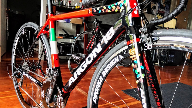
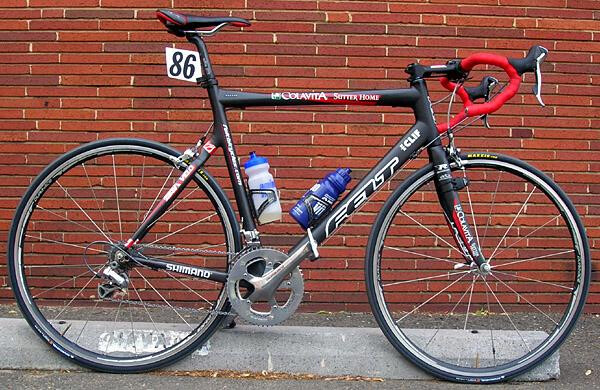
It’s the only time I’ve seen effective sponsor branding on a bike.

It worked because tioga and easton where obviously doing techy custom stuff for him that we probably couldn’t get our hands on. Like not just a Thompson sticker cause it came with the seat post but development was done.

It worked on Tomac, but IMO it doesn’t work on the upcoming Stridsland.

To me, a sticker bomb, the coolest version on a bike, works only with stickers that aren’t big brand logos.

2 Likes

The Jelly Belly team got close, i think. We generally only see title sponsors on the frame itself.

The Maipei team bikes are also a good example, but Maipei had a very consistent livery across sports.

3 Likes

GMBN made a modern replica and it’s a miss too

3 Likes

I have a Colavita / Sutter Home Felt road bike lol

3 Likes

These are nice

7 Likes

They should start putting web addresses back on bikes too

9 Likes

shartmo you need a big surface for the aesthetic to work, which is why it works better on a jersey or motorsports

9 Likes

Haha nice

This is something too, Coalvita looks like a custom bike frame logo anyway

1 Like

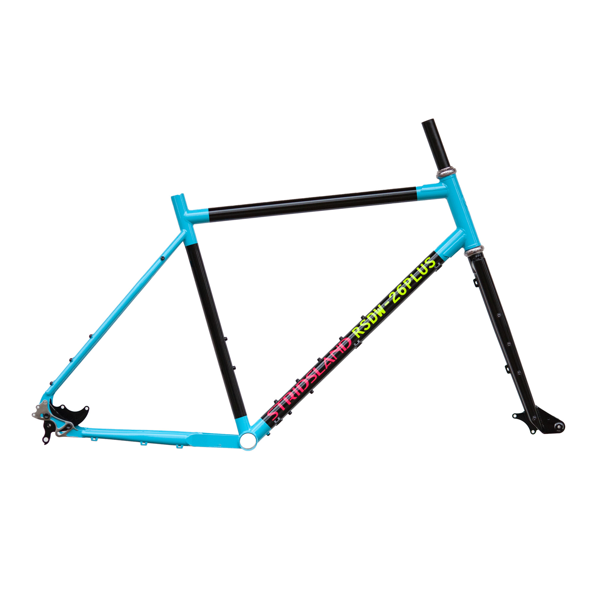
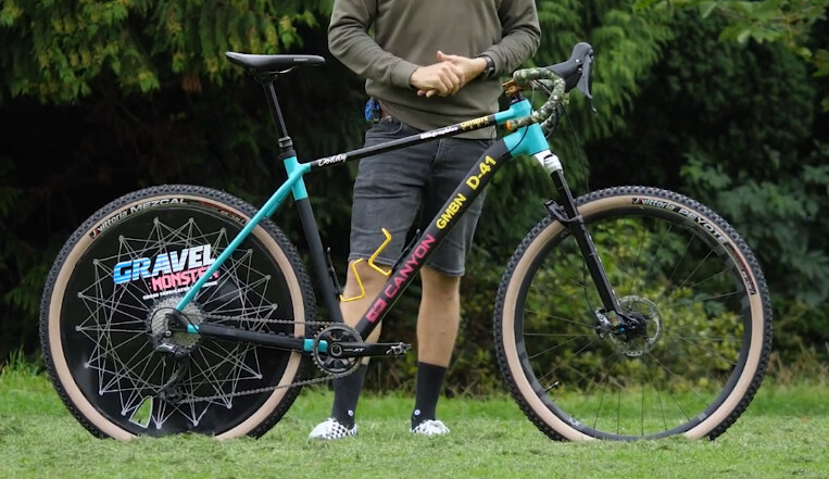
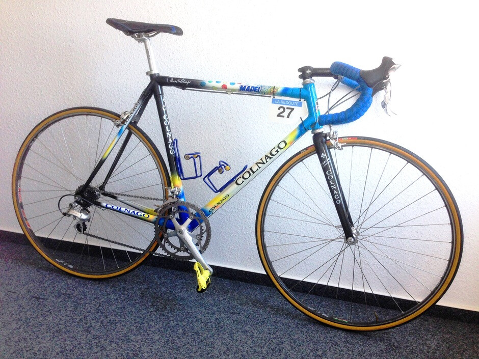
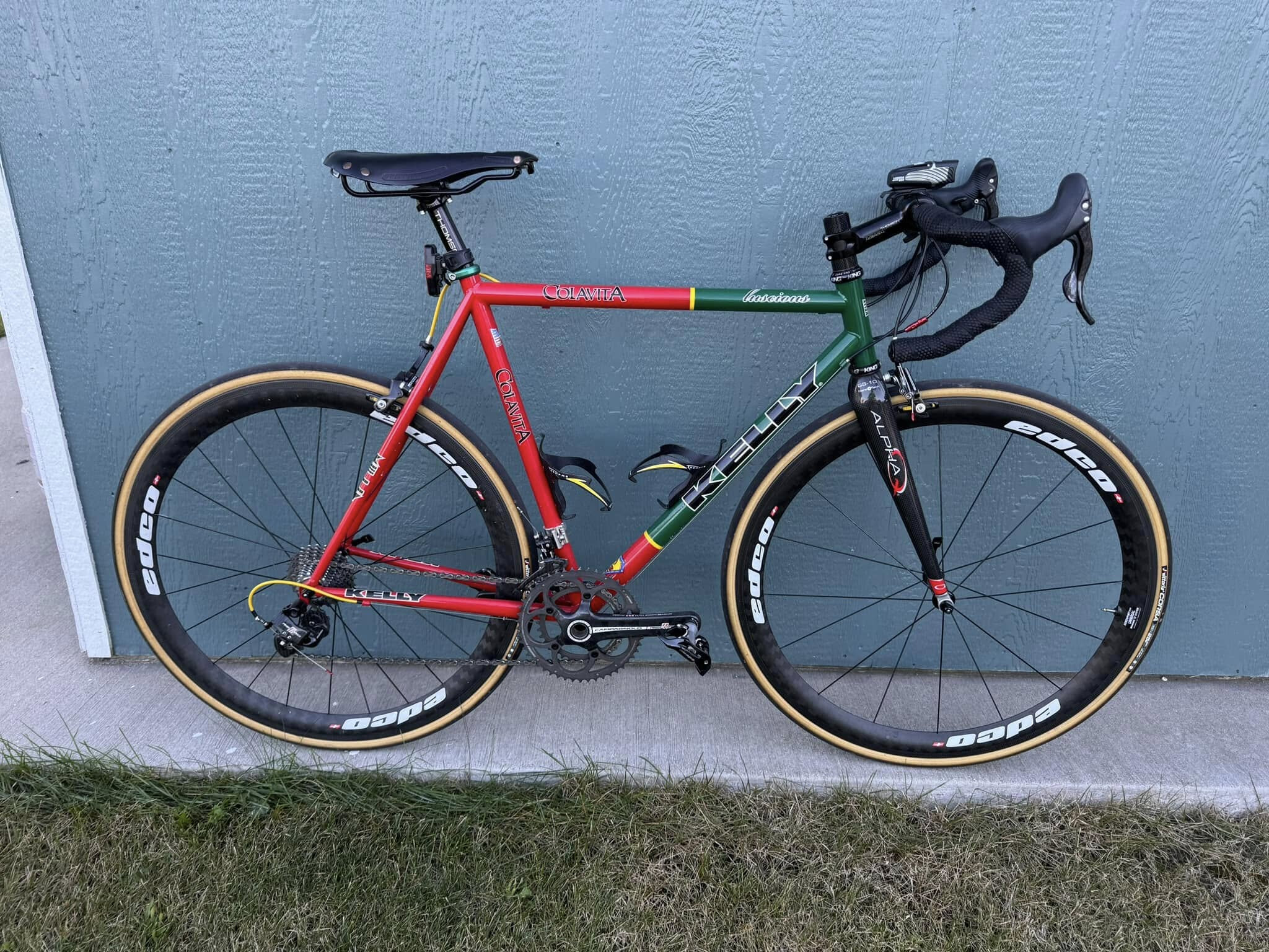
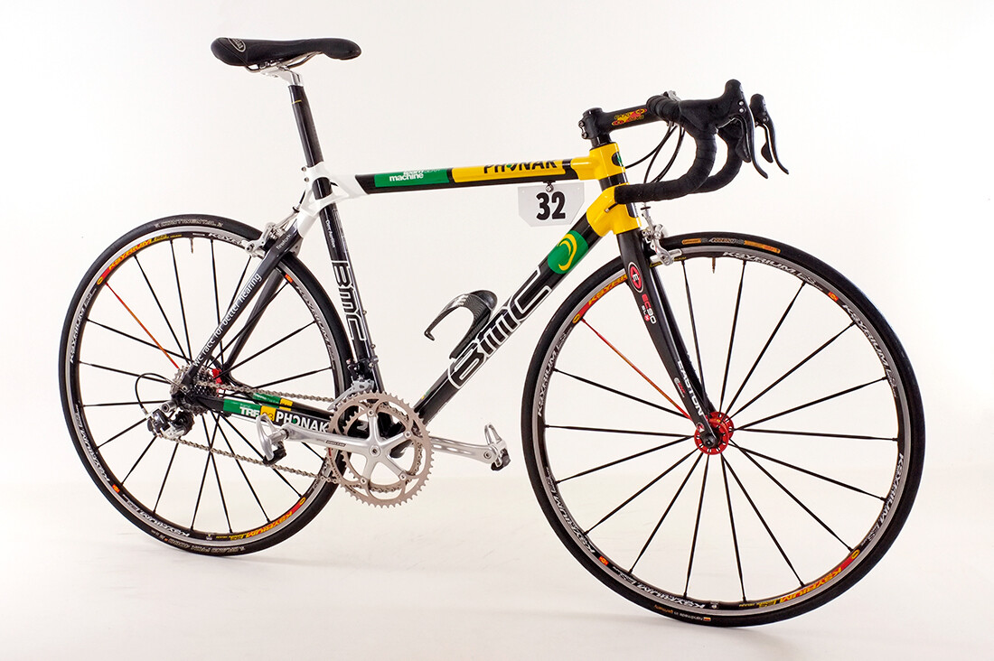
I’ve been thinking about how this was/is a retro-grouch complaint that bikes “went to” big tubes to get more space to advertise. And it’s like, that’s great because skinny steel tube bikes restrict the aesthetic so much it’s nice to have variety. But it seems like the space often isn’t used well, although I think we’re in a low point for overall bike paint/aesthetic anyway.

2 Likes

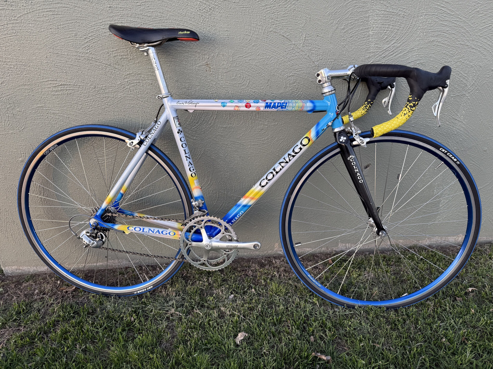
Oh yeah, and Clif. My frame has nicer lines than that one though, imo. It is an older scandium model. Round or slightly oval tubes on main triangle. Dang, now I’m getting nostalgic. It hasn’t been built up in almost 10 years.

1 Like

Who here has the T-Mobile bike? I was thinking the same thing about fat tubes. The TdF TT bikes tend to get more logos.

3 Likes

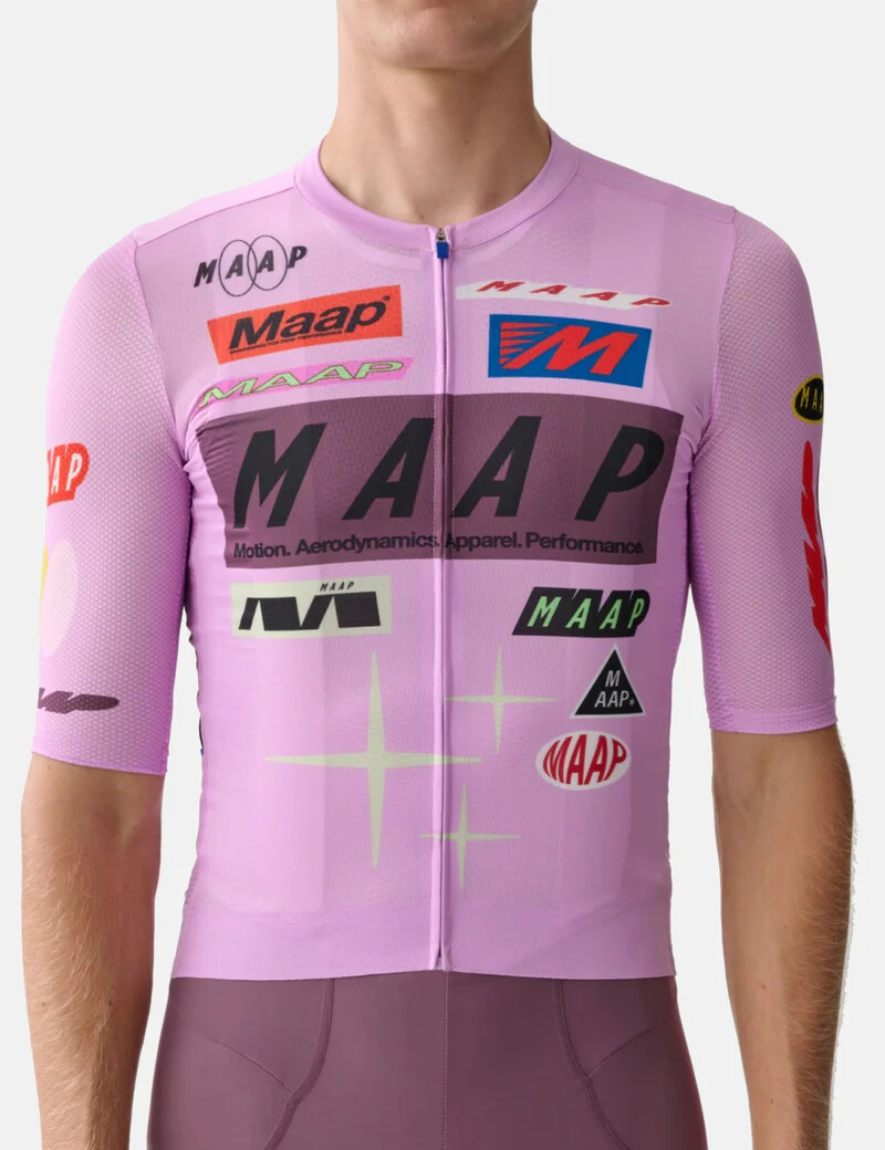
for me the low point was the late-90s to early 00s swoosh shapes on everything, multiple brand logos on non-pro bikes, and the full URL with the http://www

production bikes now have more interesting paint and cleaner design… cervelo aspero, 3T, open, plus all the wild sworks

1 Like

My 92 steel sworks doesn’t say stumpjumper anywhere and the spec logo is almost a shadow. People never clock it

1 Like

4 Likes

This is close but not quite “so bad it’s good”
2002

A few years later I think this is nice

5 Likes

Lawd help me, but I still think Ksyriums look cool.

5 Likes

I still love fat bladed spokes on road wheels

4 Likes

the red spoke was marketing genius

1 Like

prefer the red to the TDF yellow atmo